
System Overview
Skipper is a specialized B2B yacht procurement platform designed to streamline communication between owners, crews, and suppliers. The system serves as a centralized "Single Source of Truth" for managing complex equipment ordering lifecycles—from request and approval to delivery—within a high-precision marine environment.
The Challenge: From Aesthetic Upgrade to Product Overhaul
The original brief was a visual redesign of an existing enterprise system. However, I identified that the primary friction was functional, not just aesthetic. The system suffered from high cognitive load and inefficient workflows. My challenge was to restructure the Information Architecture to support complex, data-heavy tasks while ensuring a modern and intuitive experience.
Design Strategy: A Desktop-First Approach
Based on user research, the primary workflow occurs in professional office environments or dedicated workstations on-board. Users manage expansive catalogs and multi-item orders across high-resolution monitors. The Strategic Choice: While many products prioritize "Mobile-First," Skipper was intentionally designed as a Desktop-Only experience. This supports the high-density data requirements and "Power User" workflows that require maximum screen real estate and precision for batch processing.
My Role & Goals
I led the comprehensive UX/UI redesign, focusing on transforming technical complexity into operational efficiency. Key Goals:
-
Simplify Complexity: Reduce cognitive load through improved information hierarchy.
-
Optimize Workflows: Streamline ordering and approval processes for speed and accuracy.
-
Visual & Functional Clarity: Create a consistent enterprise UI that maintains functional depth.
Constraints & Requirements
I worked within the constraints of an existing system architecture and predefined workflows. To ensure a rapid and efficient delivery, I adopted an agile, iterative design process. This allowed me to move directly from product logic to high-fidelity UI, ensuring that functional improvements were validated in real-time without a traditional wireframing stage.
The Solution
The redesign overhauled key system flows—equipment ordering, catalog management, and professional approvals. By implementing Progressive Disclosure and Batch Actions, the system now provides the tools professional users need to manage complex operations with maximum clarity and minimum "click-debt."

The design

Equipment Awaiting Pickup screen
Context: Logistics Managing logistics and operational transparency between ship crews/yacht owners and the warehouse.
Challenge: Lack of clarity regarding equipment location; the system didn't specify which warehouse held the equipment, leading to delays in pickup coordination.
Solution: Implementation of a dedicated 'Awaiting Collection' status and precise warehouse location details.
Rationale (Added Value): Reducing supply chain uncertainty. This change enables real-time transparency, prevents logistical bottlenecks, and streamlines the entire pickup process.

Equipment Ordering screen
Context: Central platform for managing and executing procurement of critical technical items and consumables (food) for yacht maintenance.
Challenge: Managing high-density data in multi-item orders led to high cognitive load, typing errors, and a lack of readily available technical information for informed decision-making.
Solution:
-
Progressive Disclosure: Input field filtering to hide/show search fields, optimizing screen real estate.
-
Situational Awareness: Visual indication of the total number of items in the order.
-
Batch Actions: Drop-down menu with checkboxes for multiple SKU selection.
-
Data Transparency: Addition of a detailed item information document (manufacturer, dimensions, durability).
-
Interface Scalability: "Kebab" menu for quick access to advanced actions (upload, edit, delete).
Rationale (Added Value): Significant improvement in Efficiency. This saves valuable typing time, prevents costly purchasing errors, and maintains a clean, scalable interface that can grow with the system.
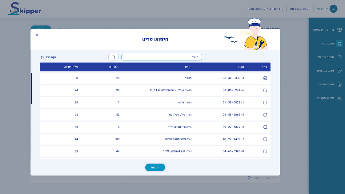
Equipment Ordering screen, Item Search Pop-up
Context: Improving the flow of adding items to the catalog within the Discovery phase.
Challenge: The original system enforced a "Blind Search"; without a default display, the user was forced to rely on memory rather than recognition (Recall vs. Recognition), creating a high entry barrier and friction in the procurement process.
Solution: Transitioning to a Pre-loaded State that displays a full, scrollable catalog the moment the window opens, combined with a Real-time Filtering textual mechanism.
Rationale (Value Proposition): The transition from active search to passive filtering improves the Discoverability of items and significantly reduces the time required to add a product to the cart.

Equipment Ordering screen, File Upload Pop-up
Context: Enriching order data with relevant technical documentation.
Challenge: Inability to attach specific technical specifications or images to individual items, leading to misunderstandings with suppliers and incorrect model orders.
Solution: Integration of a dedicated file upload pop-up, allowing attachment of documents per item.
Rationale (Added Value): Ensuring Data Integrity. Empowering users to provide context for each item guarantees accuracy in the procurement process and prevents financial losses.

Equipment Ordering screen, Order Summary Pop-up
Context: Validation phase - the final review before committing to a purchase.
Challenge: Poor visual hierarchy and scattered display of order details made verification difficult, impacting user trust before submission.
Solution: Reorganization of the Information Architecture general order details at the top, followed by a clear, detailed list of ordered items.
Rationale (Added Value): Creating a clean "Final Check" experience. Clear headings and attached file summaries provide users with full confidence to confirm their orders quickly and accurately.


Requirements Tracking Screen (Open/Closed States)
Context: Monitoring and control of existing orders.
Challenge: Lack of granular control for data export and slow identification of requirement types within long lists.
Solution:
-
Granular Control: Added checkboxes for selective requirement export.
-
Visual Communication: Implemented Color Coding for different requirement types for quick scanning.
-
Progress Tracking: Display of clear visual and textual status for each requirement.
Rationale (Added Value): Demonstrating an understanding of States Management and improving the Readability and Scannability of the system for high-volume data.

Requirements Tracking Screen Warehouse Demand Pop-up
Context: Managing the direct supply process from the warehouse.
Challenge: "Click-Debt" Users were forced to perform unnecessary actions and navigate between fragmented screens just to view basic information or understand the demand’s progress.
Solution: Consolidating all demand details into an organized Single View, alongside the implementation of clear status indicators presented both textually and visually.
Rationale (Value Proposition): Eliminating the need for extra clicks ("Read more") combined with accessible status tracking streamlines the warehouse worker's workflow. It provides the immediate, available information required to complete tasks and allows for continuous monitoring of order stages.

Catalog Management screen
Context: System Maintenance - managing and building the database of available items.
Challenge: Visual inconsistency and a passive interface that didn't allow direct editing and quick deletion of items.
Solution: Consolidation of actions under a Kebab Menu, consistent placement of the download function, and introduction of direct inline editing capabilities for items within the catalog.
Rationale (Added Value): Maintaining System Consistency. Consistency builds "muscle memory" and reduces error rates, while direct editing transforms catalog management into a more active and efficient process.

Catalog Management Screen Copy from Catalog Pop-up
Context: Reuse of existing data to streamline similar orders.
Challenge: Cumbersome interaction requiring manual ID entry and tedious searching, without a quick clear-all option for multiple selections.
Solution: Displaying catalogs by default, adding advanced search functionality (by name/user), and a "Clear All" button.
Rationale (Added Value): Optimization of Efficiency. Removing technical barriers (manual ID entry) makes the copying action more accessible and faster, encouraging data reuse and saving significant time.

Recurring Orders Screen
Context: Streamlining workflows for frequent users and managing order history.
Challenge: Order duplication and data export were cumbersome processes. Duplication involved multiple steps and redundant pop-up windows, while exporting required a separate action for each individual order.
Solution:
-
Workflow Shortcut: Implementation of a quick duplication feature via a Kebab Menu,which directs the user straight to the editing screen with pre-populated data.
-
Batch Export: Centralizing the export button in a strategic location above the list, enabling the selection and simultaneous export of multiple orders (Bulk Action).
Rationale (Added Value): Generating high business value by reducing "Time-to-task" and automating repetitive actions. Additionally, system-wide consistency was maintained through the use of dynamic filter fields (Show/Hide), allowing users to manage screen real estate efficiently.

Professional Approval Screen
Context: Oversight and decision-making by authorizing personnel prior to the procurement process.
Challenge: "Decision Fatigue" resulting from data overload. In the original system, approvers struggled to gain a quick overview of the pending task volume and the core details of each request.
Solution:
-
Progressive Disclosure: Utilizing dynamic filter fields and displaying requests through expandable rows (Accordion style), ensuring that in-depth information is only revealed when necessary.
-
Volume Indicator: Adding a prominent visual indicator for the total number of pending requests ("Total Requests").
-
Visual Hierarchy: Reorganizing the data structure (quantity, SKU, urgency) for rapid scanning and creating a clear separation between request details and the action area (Approve/Reject).
Rationale (Value Proposition): Creating a goal-oriented workspace that allows the approver to understand the scope of work within seconds. By accessing deep details only when a decision is required, the process leads to faster and more accurate decision-making.

Reflection & Insights
Key Insights
-
Efficiency for Power Users: In high-density B2B systems, "clean design" means clarity and scanability, not empty white space. I learned that for professional users, success is measured by the speed and accuracy of processing an order. This led to the strategic implementation of Progressive Disclosure and Batch Actions, balancing functional depth with a streamlined experience.
-
UX is Foundation, not Polish: This project reinforced that UI and UX are inseparable. By identifying logic gaps in the original brief, I transformed a basic display interface into a high-productivity work tool. My focus remained on Data Integrity—ensuring every technical detail is accessible exactly when needed to prevent costly operational errors.
What I Learned
-
Adapting the Process (Agile Design): Navigating the project without the traditional wireframing stage taught me how to work in a highly iterative, agile manner. Relying on strong product logic and immediate visual feedback allowed for rapid UX decision-making without compromising the final output.
-
Strategic Autonomy: I learned the importance of looking beyond the initial brief. By advocating for necessary functional changes rather than just "skinning" the existing UI, I provided the client with a tool that truly solves business problems in a demanding, specialized industry.
